
Check out 2019 Best Color Combination Of Wears That Will Leave People Stiring. (Part 2)
1. Sailor Blue and Mint
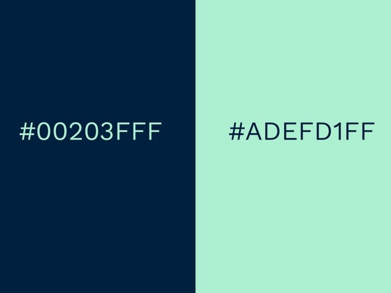
There is an old saying that claims, blue and green should never be seen without a color in between! While this is often true, there are exceptions to every rule – navy and mint is one.
This is a surprisingly cool color combination because it is unexpected. This sorbet mint is fresh, zingy and very much on-trend. Pastels have been prominent for some time now and show no signs of diminishing. The inky navy color is deep, rich and almost masculine. When they converge the result is interesting and elegant.
Technically the tones should conflict, but in reality the subdued rich navy offers a solid base for the vivacious mint. The darker hue acts as an anchor without being stark. This palette would be wonderful when worn together or as a living room or bedroom color scheme. The colors also work particularly well when used in typography.
2. Gray and Lime Punch
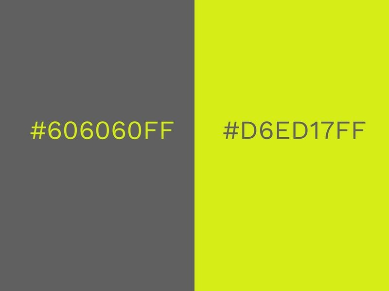
Forget orange – gray is definitely the new black. Sales in gray kitchens, cars and clothes have soared in recent years because it is such an adaptable neutral. Gray can be warm or cool, hard or soft, it is exceptionally versatile and flattering.
Traditionally gray has a reputation of being flat or dreary, and there are times when that still applies (nimbostratus clouds, I’m looking at you!). But grays status has been elevated of late, and now it is synonymous with sophistication.
To really add a bit of personality and confidence, pair a deep shade of gray with a spirited splash of lime. This zesty shade is an important trend for 2020, but it should be used with caution! Lime green can be garish on its own, it can also be harsh worn on anything lighter than caramel skin tones. But when applied well it makes a striking statement. This edgy color combination is our personal favourite here at Design Wizard!
3. Cherry Tomato and Rapture Rose
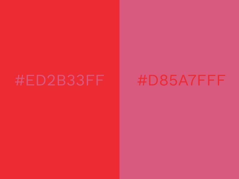
Another combination that challenges the rules is this tomato red and dusky pink. Red and pink can sometimes be an eye-watering combination, and not in a good way! But it can work – the important thing to get right is the balance of tones.
This twosome is successful because neither are vying for attention. They are close in terms of saturation – or in non-designer jargon – the shade intensity. If either, or both, were brighter they would clash.
Red and pink are also a monochromatic color scheme which makes for a complementary palette. Monochromatic means that they exist in the same color family. White, gray or black can be added to the base hue, which in this case is red. Mixing these together can create a variety of tints, shades and tones, such as pink.
The beauty of this particular pair is that the two individual shades are cool and modern. The exuberant orange red sets off the purple undertones of the pink. Include white to keep it crisp.
4. Forest Green and Moss Green
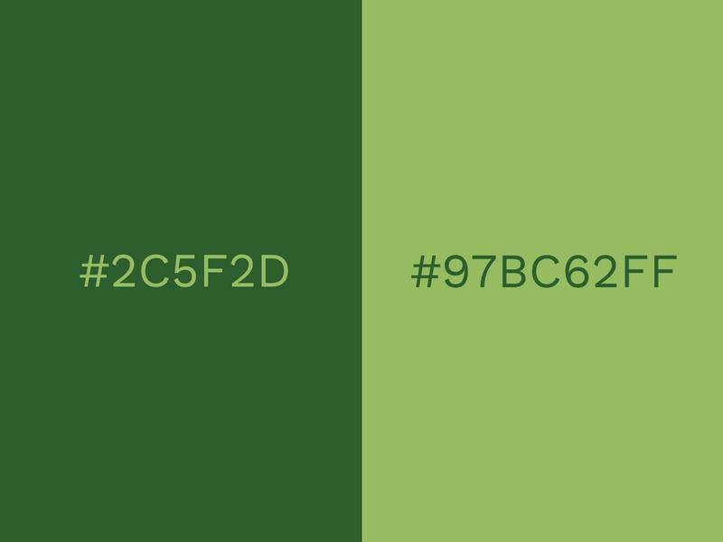
As we move further into the digital age, there is a growing effort to keep our feet planted in the real world. As stress and pressure increases, there’s more emphasis than ever to embrace the natural, wholesome and healthy aspects of life. In 2017, the Pantone Color of the Year was called Greenery and it truly reflected this movement.
Greenery: a light, bright grass green, really planted the seeds for this year’s version to develop. This year’s trending color combination shows how green has matured into something more edgy and dark. The moody Forest Green can almost look black in some lights but it is lifted by the refined tones of the Moss Green.
This green on green falls in to the same category as the monochromatic color scheme above, but it is much easier to work with (especially in the natural tones). For interior design, this combination works well next to wood. In fashion, it looks expensive, especially when worn with metallics (use rose gold for extra trendy points!). Green is also gender neutral and suits most skin tones and hair colors.
5. Royal Blue And Peach
Royal Blue and peach is this year’s version of the classic blue and white (and not a million miles away from turquoise and sand).
Royal Blue is pretty much primary blue, so it is durable and solid. But because of its boldness, it is also playful. And there is a resurgence for the notion of playfulness. As the concept of creativity is becoming more prominent in our lives, from our architecture to our business strategies, playfulness is now socially accepted. This is also a nod to the 80s, which is having something of a revival in graphic design.
The trend of pastels came up earlier, and even though pink and lilac have been the most prominent so far, peach is in the spotlight now. Together they really combine to create a super modern finish.
#Part 2...