Check Out 2019 Best Color Combinations Of Wears That Will Leave People All Staring. (Part 1)
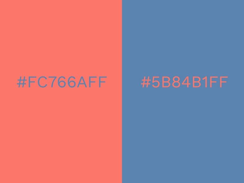
1. Living Coral And Pacific Coast.
The 2019 Pantone Color of the Year is Living Coral. It’s a lively, nourishing color that has a youthful flavor to it. When combined with the refreshing blue of Pacific Coast, it evokes images of the ocean floor and a vibrant seabed filled with coral.
Pacific Coast is deep, yet not overbearing, and complements the subtle tone of Living Coral. Atypical to most shades of blue, there is almost a certain warmth to it. This only serves to enhance the calm yet energetic vibe of Living Coral.
Dynamic color combinations like this one can be employed in so many different places, such is its unobtrusive nature. It’s relaxing to look at and can create a laid back vibe wherever it is featured.
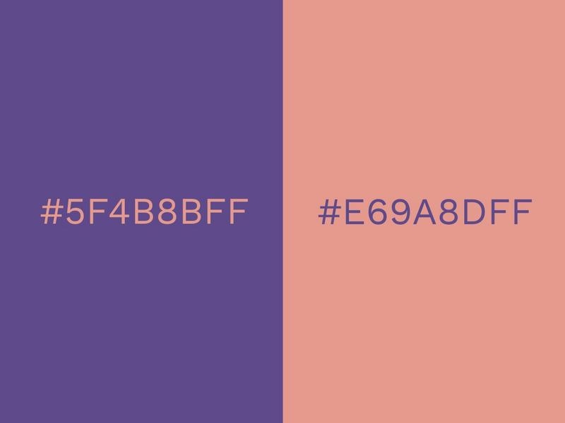
2. Ultra Violet and Blooming Dahlia
We can’t talk about trending colors without having Ultra Violet near the top of the list. This vivid, bold shade was the Pantone Color of 2018 and it will continue to feature the next 12 months too.
Purple is a strong and powerful color with positive connotations like magic, luxury and creativity. For such an attention grabbing color, it’s still surprisingly uncommon. In fashion and interiors it tends to be used sparingly, but if there was ever a time to go crazy with purple, it is now.
Purple works well for marketing because it is so vibrant and pops off the page. This is one of the reasons why we chose it as our primary brand color! It is also super versatile and goes well with many other colors, such as green, red and orange. But for a really cool color combination, try matching it with this warm pink/nude color. This particular shade is sophisticated and understated and gives balance to the rich and robust purple.
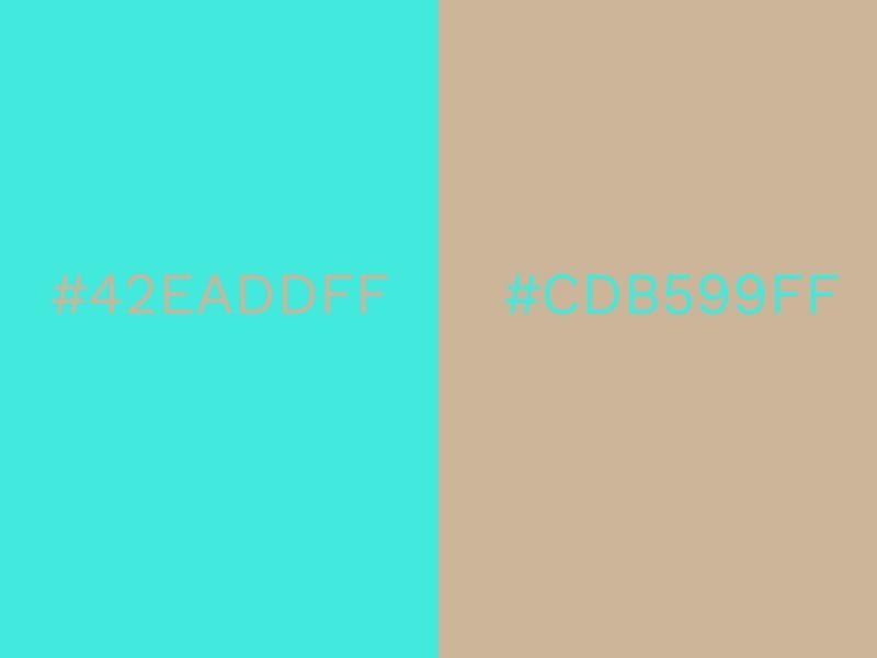
3. Torquoise and Warm Sand
Is there anything more uplifting than a bright burst of turquoise? It is such a refreshing color that conjures up images of tropical waters and sunny skies. Turquoise is also unique in that it manages to be serene and idyllic as well as vivid and dramatic.
For many people, turquoise is the color of summer, so combining it with a soft, sandy shade creates a natural, harmonious balance. This neutral color wouldn’t win any prizes on its own but when laid alongside turquoise it becomes warm and golden. You can almost smell the salty sea breeze!
This color combination is natural and youthful and could be used for inspirational communication. Give a firm farewell to the dark days of winter with these gorgeous colors!
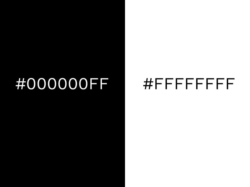
4. Black and White.
When it comes to classic color combinations, it doesn’t get any more timeless than black and white. But timeless doesn’t mean stagnant. From looking at 2020’s trend predictions, we can see that black and white is going to be huge.
The combination works because it creates ultimate balance. Black is strong and dominant and white is peaceful and pure. From a tonal point of view they are polar opposites, but it is this contrast that makes black and white so effective together.
Individually, they can be overwhelming in large doses, but when placed side-by-side the two colors enhance each other. From a visual perspective, black becomes darker and white is highlighted. The results are clean, crisp and contemporary. Black and white is popular in all areas of design. Graphic designers and marketers use it to deliver powerful and clear messages, and it is a staple part of the fashion industry.
Black and white often features in interior design when the desired impact is to be modern and crisp. Inject primary or neon colors to black and white for a funky finish.
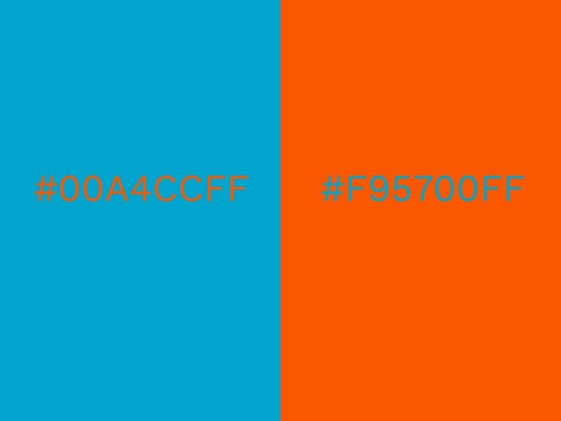
5. Blue and Orange
The classic pairing of blue and orange never fails to inspire; it is another good example of when opposites attract. The cool tones of blue emphasises the warmth that orange radiates. This pairing is often found in nature too and is meant to be comforting and familiar to the human eye.
From a communication perspective, the color combination of blue and orange has been used in countless posters, adverts and campaigns over the years. It is a highly effective method of catching an audience’s eye.
Used most often in bold tones to grab attention, this year’s trend is in tweaking the saturation of either shade. This pastel take of the complementary blue and orange doesn’t diminish its effect. The energy from this blood orange shade sets off the soft powder blue perfectly. Blue is widely used to represent business and is always effective in marketing and promotion but the pop of orange shows that you are not afraid to stand out.