Check out 2019 Best Color Combination Of Wears That Will Leave People Stiring. (Part 3)
1. Electric Blue Lemonade & Aquamarine
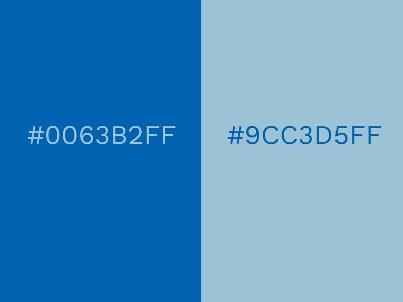
The duotone of Electric Blue Lemonade and Aquamarine has the potential to give your design either a professional or casual look, depending on how you create it.
The vivid Electric Blue Lemonade becomes more relaxed and amiable when accompanied by the softer Aquamarine.
Blue inspires trust and professionalism, so it is widely featured in color combinations that are used for a business logos and websites. Dark blue brings sophistication and intelligence, while light blue is a source of honesty and clarity.
2. Orchid & Cream Gold
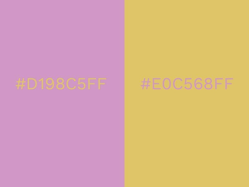
Orchid is a striking shade of pink that strays tentatively into the territories of purple. It’s girly and fun, but slightly more mature than some other pinks.
Cream Gold is luxurious and warm, with a liquid gold texture that’s enticing to the eye. Orchid beautifully enhances this effect, blanketing Cream Gold smoothly.
It’s a combination which gives a certain elegance to a design. Pink and gold has substance to match its style and this makes it a very popular choice for weddings and engagement parties.
3. Black & Blazing Yellow.
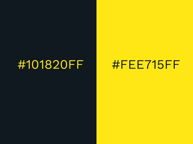
Probably one of the most common contrasting color combinations, black and yellow is used in so many different situations. Due to its prominence, you’ll find it on many hazard signs to notify people of danger.
Yellow has been known to stimulate mental activity and when combined with the depth of black, it’s ideal for creating a contrast that makes things easy to read and easy to understand.
Black is a mysterious color that represents the unknown, but Blazing Yellow appears more welcoming and close at hand.
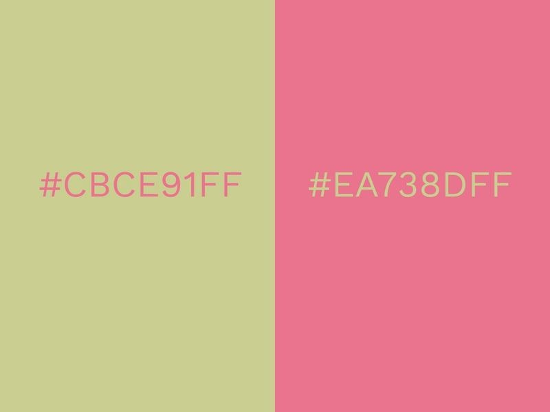
4. Pale Green & Bubble Gum Pink
5. Copper Coin & Aged Copper
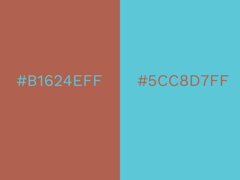
The shimmering brown of copper eventually turns to turquoise with the passing of time. With Copper Coin and Aged Copper, the two spectrums of copper can bridge the gap in years to form a stunning combination.
You can make your new designs look notably vintage with the right amount of tweaking. Aged Copper is of course a turquoise shade, so it easily conveys feelings of refreshment, calm and serenity.
Copper Coin is wholesome and secure, but it’s coin-like texture also reminds us of money, piping and other copper objects.
Part 3
--- The End
Part 4 coming soon...
